Recap 01/2023

As the new year kicked off, one of my goals was to share more of my design work. I am fortunate to work on a wide variety of projects across different industries and using various mediums. I often get asked what I do, so I am using this quarterly email series to recap some of the work I was involved in launching over the past 3 months.
Thank you to all of the wonderful collaborators, partners, and of course, clients who helped make these projects a success.
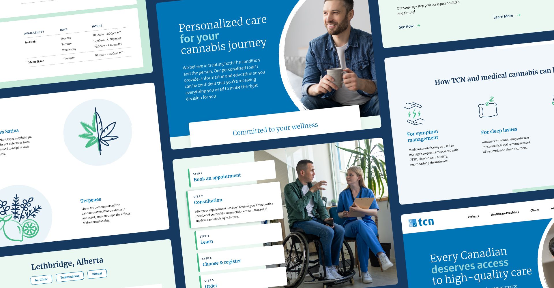
TCN Website Redesign
This one certainly didn't start this past quarter, but I am proud to see it recently launch. Over the previous 6+ months, we completely transformed and evolved the TCN brand, starting with a visual refresh which included new fonts, colours, and photo direction.
To better reach their audiences, particularly patients looking for support around medical cannabis, the website redesign included the exploration of more efficient user flows, new content development, custom iconography, and responsive page design and development.
Check out all the hard work of many talented people coming together for this relaunch.
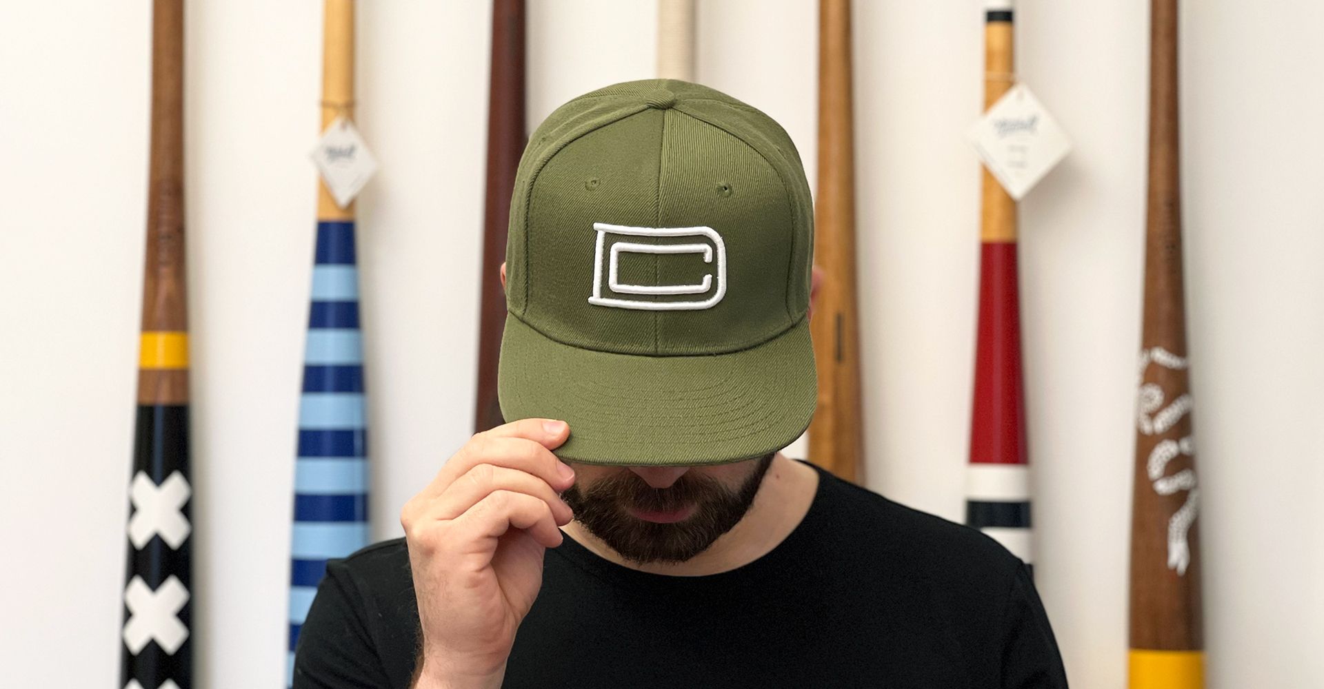
DC Branded Hat
As baseball spring training began in early February, and I started to see all the latest uniform designs, it got me thinking – I wear hats from a bunch of these teams and brands, so maybe I should do my own.
When I designed my logo, I remembered how my Dad always built things by hand. He taught me the craft of making things yourself, using various manual and power tools. Those classic tool brands I grew up with influenced me to design an industrial-style monogram using my initials, which I now use for my company.
So after some research to find the right hat style in the perfect gritty olive green, I brought it down to the local Lids to have a raised white monogram embroidered onto the front, totalling over 5600 stitches.
Now that I have a personally branded hat in my vast collection, I will be adding it to my rotation.
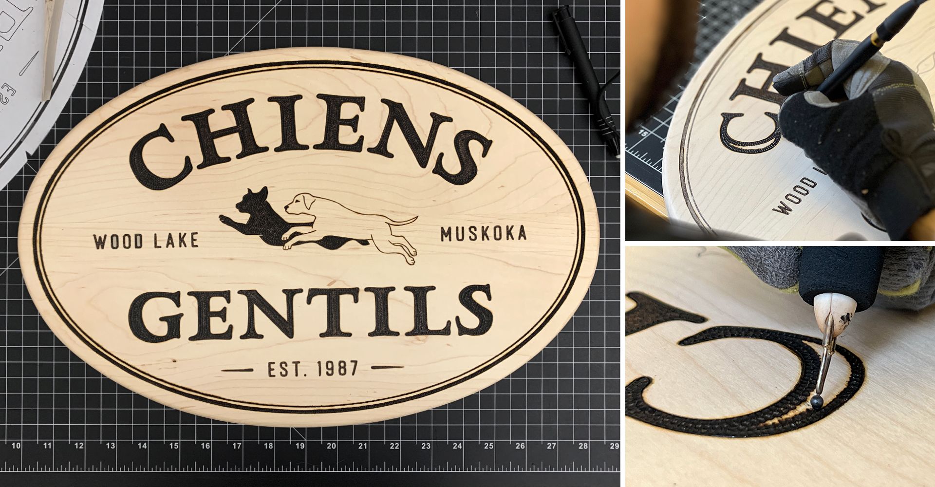
Cottage Signs
Every once in a while, I get the opportunity to work on a project where I get to create something by hand, taking me away from the computer screen and keyboard. I recently had the honour of designing a sign for a family cottage of a close friend. Inspired by their family's legacy and cozy lakeside confines, we opted to burn the design on a wooden plaque.
Collaborating with my woodworker friend Gord, from Peckerhead Designs, he made a beautiful maple plaque, as I worked on the sign graphics. From there, I applied the design to the plaque by using a stippling technique and multiple tips to burn it into the wood.
I am excited to see it hanging at their cottage the next time we visit.
If you're interested in the behind-the-scenes process of creating this, I have condensed it all down to a short time-lapse video.
Last year I started using a daily productivity tool called Analog, which is beautifully created by Jeff Sheldon at Ugmonk. It consists of a simple, single task card resting upright on a walnut base that I fill out at the beginning of my day to keep me focused.
Worth checking out at Ugmonk
The second quarter of this year is already shaping up to be a busy one. I am currently working on a branding / social media project and also launching a website redesign for a long-time client. I am excited to share them soon.
Additionally, I am working on a proper website for myself that will highlight a few case studies of past work. In the meantime, you can keep an eye on my new (very new, so not much there yet) Instagram account for some of my latest work.
I appreciate you checking this out.
Cheers
Dan Caroleo
Problem Solver | Maker | Brand Builder | Designer