
Recap 02/2026

“What do you mean Q2? That was months ago…it’s almost the end of Q3.” I know, I know. You might not be waiting patiently for this email, but that’s what the voice in the back of my head is saying.
The last recap was my first attempt at an audio version of this newsletter. I like the idea of doing it (if you listened, thank you), as it’s great practice speaking about my work, even if I cringe listening to my own voice. I did it again for this recap if you’re interested. [Apple Podcasts | Spotify]
While I was collecting all the details about these projects, a theme started to emerge: good design makes the next step clearer.
Structure, hierarchy, messaging and visual design all help people understand what they’re looking at, make a decision and confidently move forward. Good for the audience, and ultimately, good for the business.
I’ve boiled that down to “Creating Clearer Paths”, how design can help move someone from understanding to action.
Hopefully you can see that theme emerge in these projects too.
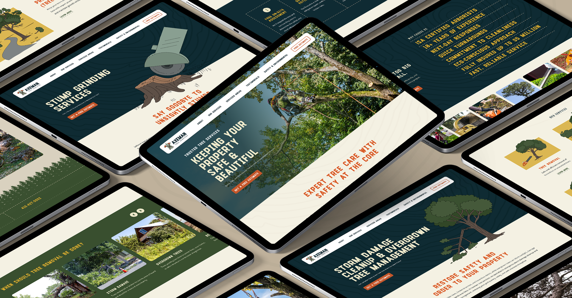
Building Axeman a Website for Growth
Mike’s tree service business was growing, and he needed a website that could clearly communicate his services, build trust with potential customers, and make it easy for them to request a quote.
The new website brings together all the elements we’ve been developing for Axeman, from the visual brand and custom illustrations, to detailed service information that helps homeowners understand what they need and what to expect. The site is structured to create a clear path from finding the right service to requesting a quote, while also building a foundation for long-term search visibility and future growth.
So far, it’s already generating inquiries without any big promotional push. Check it out.
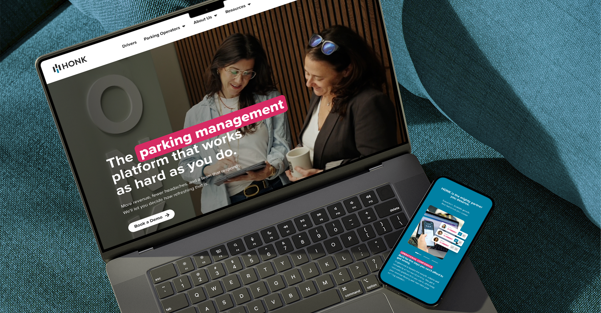
Bringing HONK’s New Brand Direction to the Homepage
HONK’s old homepage was trying to talk to everyone at once, both parking operators and drivers. We clarified that operators were the primary audience and restructured the experience around them, while still giving drivers a clear path to the information they need.
Building on the direction we had established for HONK’s product pages, we also wanted to bring their “Mighty Partner” positioning to life. Instead of another product interface in the hero, we focused on the people behind HONK, working with Stature Films to create a video featuring the real team.
The rest of the experience followed the same thinking: making products easier to explore and simplifying the path to connecting with HONK. Since launch, the team has reported an increase in organic conversions.
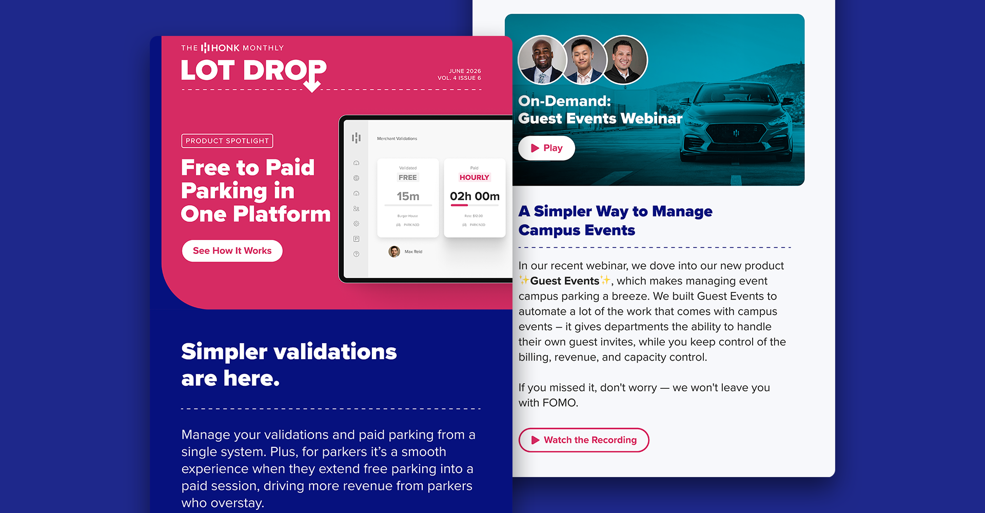
A More Focused Approach to HONK’s Monthly Email
The HONK team always has a lot of great updates to share with their customers, from new features and upcoming events to some of the fun stuff the team gets up to. Every month, the Lot Drop brings it all together.
In the previous layout, every story used to shout at the same volume. We stepped back, reviewed the content and created some structure and rhythm, more like a magazine: one lead story, a couple of supporting articles, and a collection of smaller updates. It gives readers a clearer sense of what matters and makes the whole email much easier to scan.
Visually, we brought the Lot Drop into HONK’s evolving brand system with bolder typography, accessible colours and a little more personality, while making calls to action more direct.
Since the redesign, more of the people opening the email are taking action, and HONK has even seen previously quiet prospects re-engage and book demos through the Lot Drop.
This one felt particularly relevant while putting this recap together. It’s easy to focus on what we’re designing, but ultimately the work is about helping someone solve a problem and move forward.
“Design is directed toward human beings. To design is to solve human problems by identifying them and executing the best solution.”
— Ivan Chermayeff (designer for brands like Chase, NBC and National Geographic)
Looking Ahead
Next quarter’s email should be hot on the heels of this one as I try to get back on schedule.
I also have a few long-term projects that I’m excited to finally be able to share. And you might have gotten something in the mail from me recently. More on that experiment next quarter too.
Whether you’re building something new or evolving what’s already there, I help businesses make things clearer: what they’re saying, how they’re presenting it, and where they want their audience to go next. If you’ve got something coming up, I’m always up for a conversation.
Until next time,
Dan Caroleo
Problem Solver | Maker | Brand Builder | Designer