Recap 04/2025
2026 is already flying by. The last quarter of 2025 feels like it was forever ago, but much of the work from that period is shaping what’s rolling out now. I wanted to kick things off by sharing a few key projects that set the tone for what’s ahead. If anything stands out or piques your interest, I would love to hear about it.
Like many people, I start the new year reflecting on and thinking about what's next. I’m not big on resolutions; I prefer themes. Last year’s was “more often than not", consistency over perfection. This year, I’m building on that with something simple: “sort and take action”. Fewer ideas sitting spread across notebooks, screenshots, and bookmarks. More ideas implemented. As I explore ways to achieve this, I will share some of the outcomes.
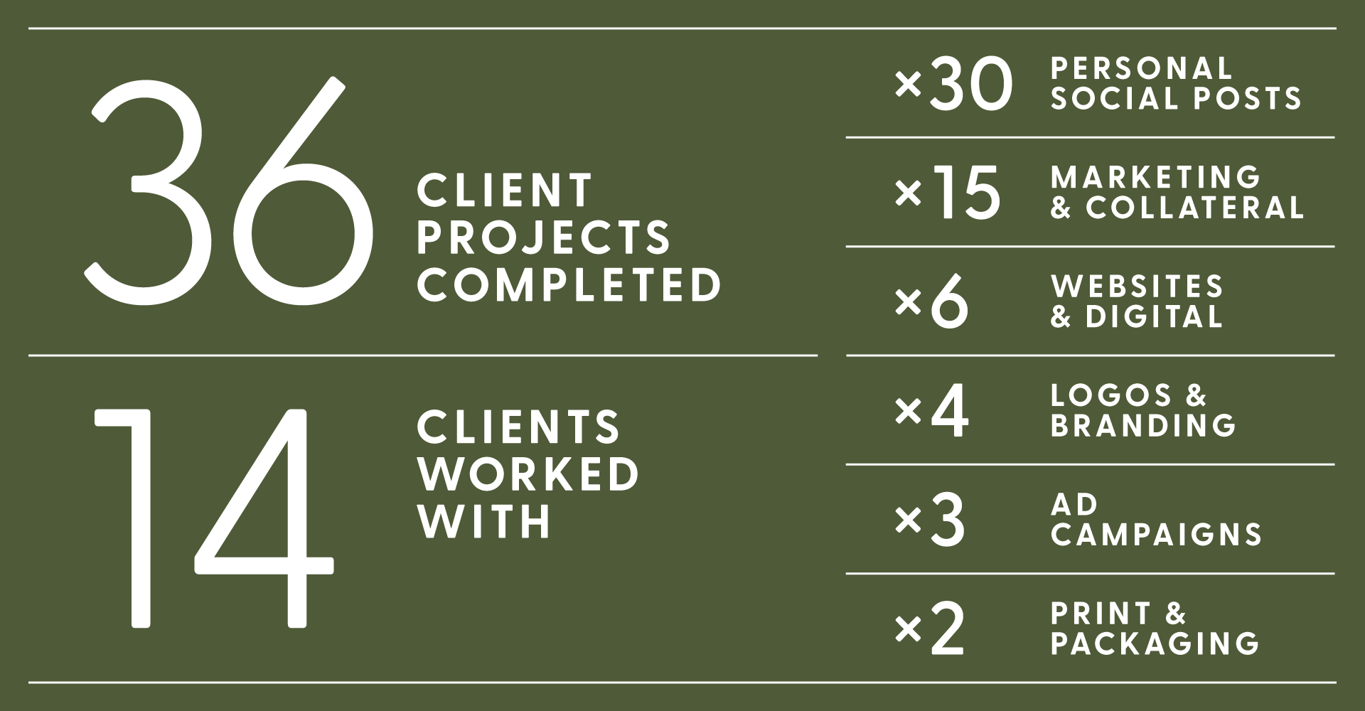
2025 By The Numbers
Looking back, 2025 was a bit up and down. Across the year, I worked with a mix of new faces and long-standing relationships. On everything from logos and full brand systems to websites, ad campaigns, print materials, and ongoing marketing support. No two projects were the same, which is exactly how I like it. Understanding how a brand needs to show up across different mediums and contexts is one of the more interesting challenges in this work, and last year had plenty of it.
The pattern I keep coming back to is this: businesses don’t just need a logo, or just a website, or just a campaign. They need someone who can see the whole picture and make sure everything connects. That’s where I want to keep building and growing those relationships.
With some encouragement, I started showing up more on Instagram and LinkedIn, nothing groundbreaking, but more consistent than before. Getting work in front of the right people doesn’t happen on its own, and 2026 is going to require more of that intentional push. Sort and take action really applies here too.
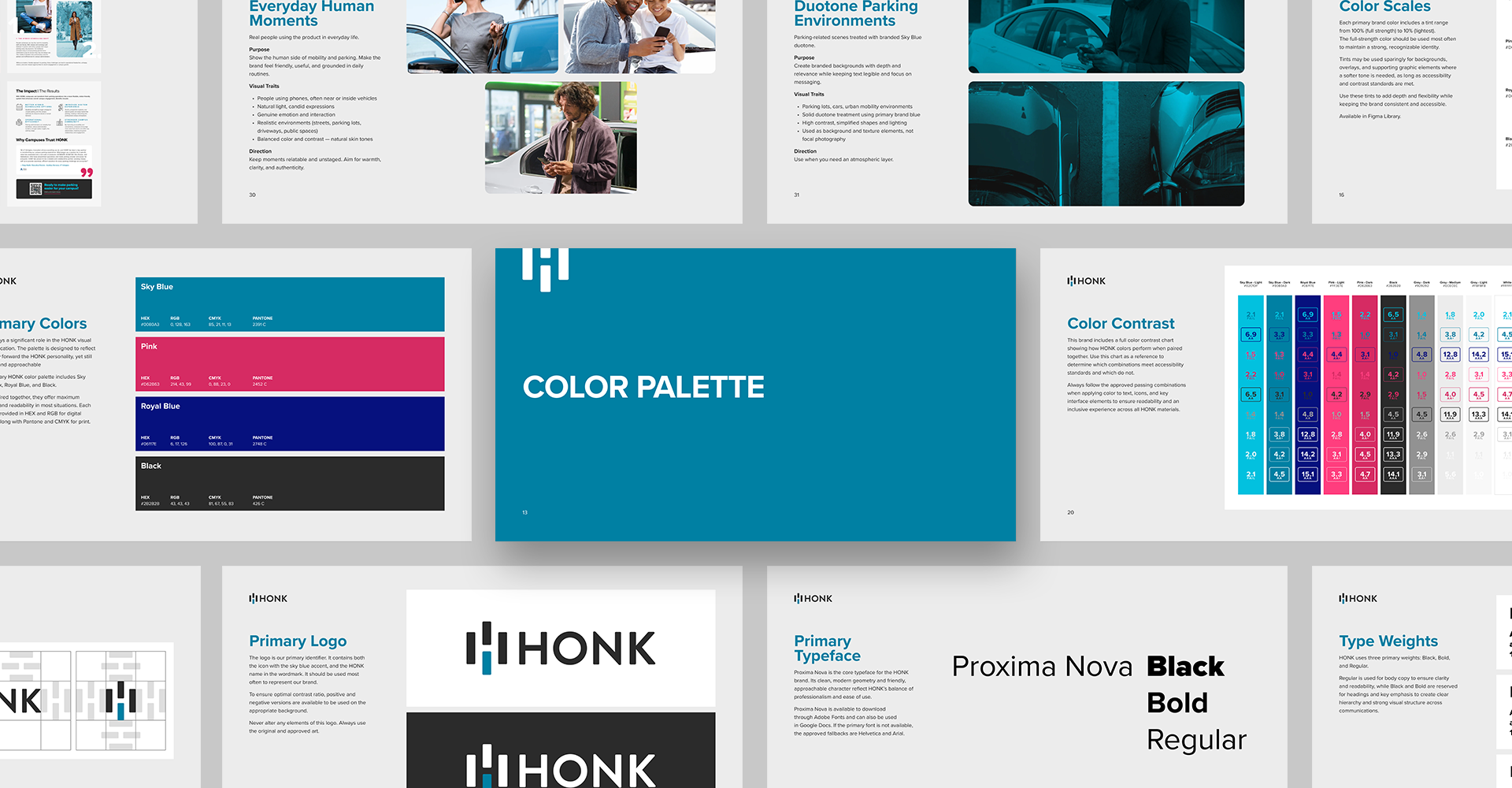
HONK - Accessibility & Brand Evolution
Colour is one of those things that looks fine in isolation but can break down in the real world. In Q4, we focused on refining HONK’s colour system after identifying that several core colours weren’t meeting the minimum contrast requirements across the full range of touchpoints like buttons, headings, and key interface elements across the app, website, emails, and even on-site parking signage.
The goal wasn’t a redesign; it was an accessibility-driven evolution of what already existed. The primary blue shifted to a darker, cooler tone. Pink became more intentional, reserved for emphasis rather than used broadly. Problem colour combinations were addressed across the board. The result is a palette that reads better, feels more mature, and holds up across every surface it touches. Updated brand guidelines captured all of it, so the system is consistent going forward.
Small shifts, meaningful impact.
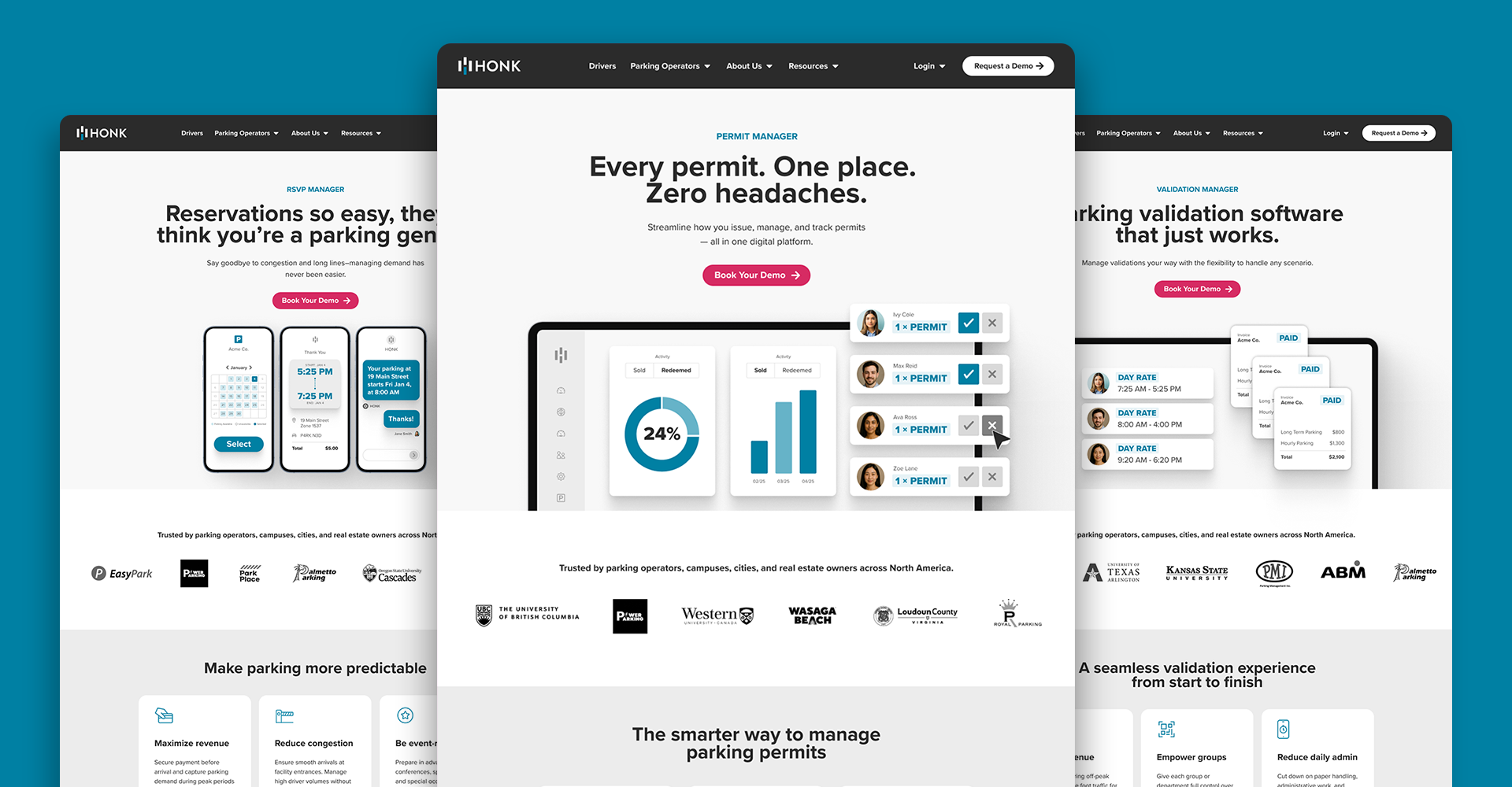
HONK - Structuring the Product Narrative
With the brand system tightened up, the next step was bringing that same clarity to how HONK’s products were presented on the website. The information was there, it just wasn’t presented in a way that helped someone make a decision.
We built a standardized framework across five new product pages, each structured around how purchasing decisions actually happen: lead with the benefit, back it up with proof, go deeper on features, then make the next step obvious. App and dashboard interface images were simplified specifically for these product pages to focus on outcomes rather than showing every detail. Bold data callouts, clear section breaks, and strong typography made each page easier to scan and act on.
The pages are built to scale. As HONK’s product offering grows, the framework grows with it.
If you run a business in Ontario, the AODA (Accessibility for Ontarians with Disabilities Act) is worth knowing about. It requires that websites and digital content meet accessibility standards (including colour contrast, as mentioned above).
Beyond the legal side, accessible design works better for everyone. The RGD’s AccessAbility guide is a good place to start if you want to understand what that looks like in practice.
Closing Note
This was the first year I completed all four quarterly updates, something I’ve been working toward for a while. I originally imagined this newsletter as a way for me to share quarterly updates on my design work, and provide insights on how I think and what its like to work with me. Thank you for following along, replying, and supporting the work. It genuinely means a lot.
In 2026, the focus is simple: sort and take action, building on stronger foundations and moving ideas forward with intention.
If any of this resonates with you, please reach out, and we can schedule some time to talk.
Until next time,
Dan Caroleo
Problem Solver | Maker | Brand Builder | Designer